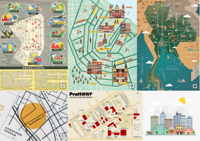
For my map of the PrattMWP campus I want to create a fun yet clean composition using a mix of grounded/neutral and more saturated colors, as well as vectors of the buildings and icons to demonstrate the purpose of each building (studio, lab, administrative, living, dining).
Published by

mopaquin
Mo Paquin is a Communications Design major with a concentration in Illustration, currently enrolled in her second year at Pratt Institute, working towards a minor in Graphic Design. Mo practices multiple media, such as colored pencil, pen, oil painting, and digital drawing with photoshop, and grew up on art sites such as DeviantArt which sparked her interest in character design and digital media. Despite the fact that she is from rural central New York state, she grew up watching Japanese animation and is inspired by Latin music. She is predominantly inspired by graphic art styles combined with realism, bright colors, and “punk” and urban culture, including fashion and street art, and is interested in combining these themes with the beauty that is the natural world of plants. She is still learning and in the midst of finding her own style, but with an Illustration degree she will one day work as a concept and character design artist as well as work in product design.
View all posts by mopaquin
